
Does Data Transformation Really Matter?
This will be short but (I hope) really useful text. In Medical Costs Analysis using a Linear Regression model we were talking about basics of using Linear Regression model for the prediction purposes. At the end of that exciting story (just kidding :D) we have presented Mean Absolute Error (MAE) and Mean Squared Error (MSE) of our predictions.
These errors are not something that we would be happy with it. We can conclude, based on the results, that Linear Regression is not good enough method for predicting these specific data and that we need to continue with other machine learning algorithms - hoping that we will find more suitable model.
BUT
Is that all from Linear Regression?
Of course not.
During the procedure of model development in Medical Costs Analysis using a Linear Regression model, we have selected and optimized DataFrame variables in the way to adequately form input and output vectors for our model. This information was further used for training and testing procedures. Something that we haven’t considered at all is one great feature called: Data Transformation.
In general, data transformation is used to change the shape of the data distribution. The goal is to change variables in the way that they can be described as a normal distribution. Linear Regression, as well as many other machine learning techniques, is maximally useful if it faces a data which are normally distributed.
- What next? The variable of interest was “charges”. Once again, let’s see distribution of the variable.
    sns.distplot(df["charges"],fit=norm)
    fig = plt.figure()
    res = stats.probplot(df["charges"], plot=plt)
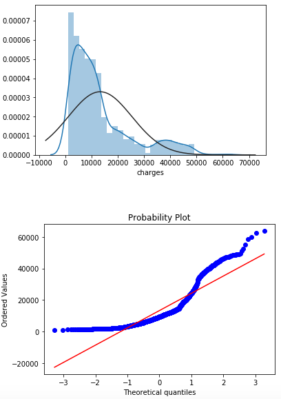
stats.probplot line of the code is used to “generate a probability plot of sample data against the quantiles of a specified theoretical distribution (the normal distribution by default)”. What does it mean in practice? If the points fall closely along the straight line, we can conclude that our analyzed variable posses normal distribution. From the probability figure above we can say that “charges” is far from that.
- How to improve our main variable? There are plenty of ways to treat your raw data, but at the beginning, we will start with the easiest solution: LOG TRANSFORMATION.
This mathematical function calculates the natural logarithm of x where x belongs to all the input array elements. The natural logarithm (log) is the inverse of the exp(), so that:
.
It make sense to use the log transformation on your data, if the data are always positive and their scales varies drastically.
df["charges"]=np.log(df['charges'])
- We have updated our “charges” category with transformed initial variable data. We will use again distplot and probplot to see what have changed.
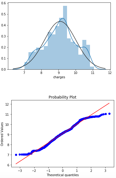
If we compare the variable “charges” before and after the log transformation, we can easily see the difference. Now, we are significantly closer to a normal distribution of data. It is not the perfect, but the difference is notable for sure.
Ok. We have transformed our category of interest. Is it going to be helpful for improving prediction capabilities of our model or not?
-
We will repeat the complete procedure of designing the Linear Regression model from Medical Costs Analysis using a Linear Regression model, with the difference of applying log transformation of “charges” variable.
-
Now, we will print new values of coefficients of our retrained Linear Regression model. Of course, after the transformation process.
    print(lm.intercept_)
    coeff_df = pd.DataFrame(lm.coef_,X.columns,
    columns=['Coefficient'])
    print(coeff_df)
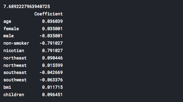
Back to the past, let’s see what we had before the log transformation:
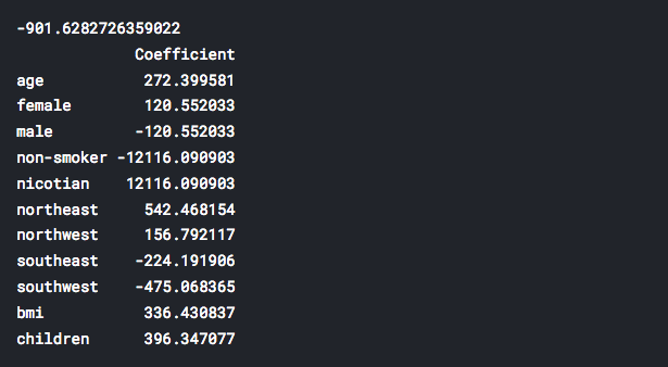
It is obvious that now we have significantly smaller values for our coefficients. How these changes will affect our predictions? We will see soon.
- Next figure is a graphical comparison of expected values of our analysis (y_test) and predicted values (predictions) of the model.
plt.scatter(y_test, predictions)
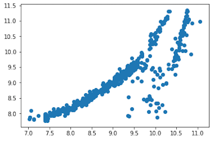
Let’s compare this with similar graph, but before we have transformed “charges” variable.
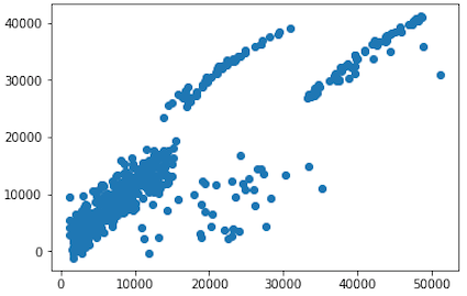
For sure, after the log transformation, scatter graph has more sense and produced dependence between expected and predicted values is more reliable for the model. It looks like that our model will have a better chance for predicting correct “charges” data, in comparison with the model from Medical Costs Analysis using a Linear Regression model.
- Finally, let’s compare the error distribution graphs of our predictions, BEFORE and AFTER the log transformation.
BEFORE
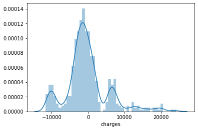
AFTER
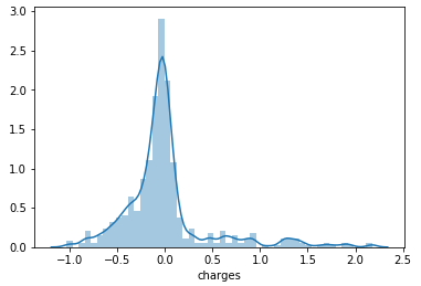
Definitely, we have improved our prediction accuracy and reduced errors of our predictions.
- At the end, let’s sum up all errors and calculate and print mean absolute error (MAE) and mean squared error (MSE) for our new predictions.

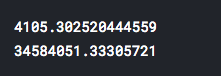
- Before simple log transformation, our errors were:
WOW! That’s a huge difference!
MAE is reduced 14783 times!
MSE is reduced over than 163 MILLIONS times!
Only one additional line of code improved prediction capabilities of our Linear Regression model incredibly much! Is it enough for you to start using the log transformation?
p.s. Small homework. We have transformed here only variable “charges”. Try to use this transformation on some other variables in the dataset. Is there additional improvement of prediction accuracy?